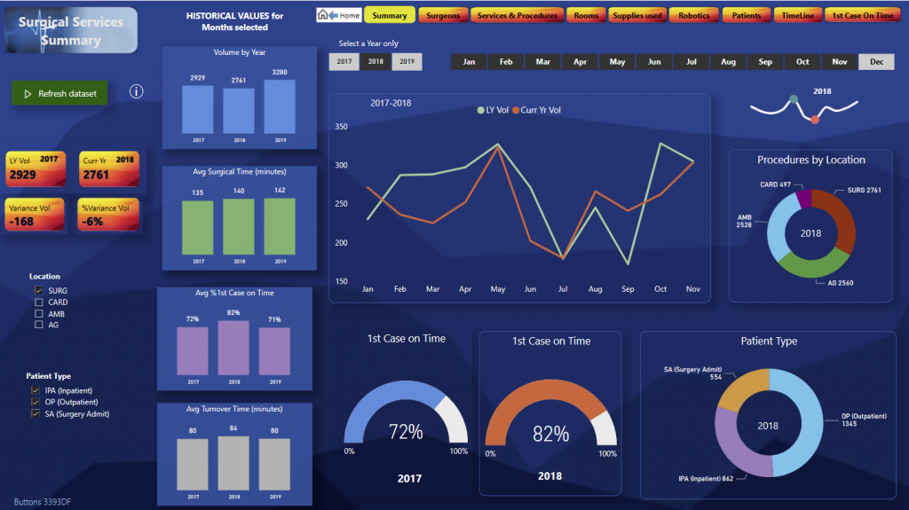
Shows volumes for current year, previous year and historical measurements for Surgery, Ambulatory, Cardiology. Timeline of surgeries.
–

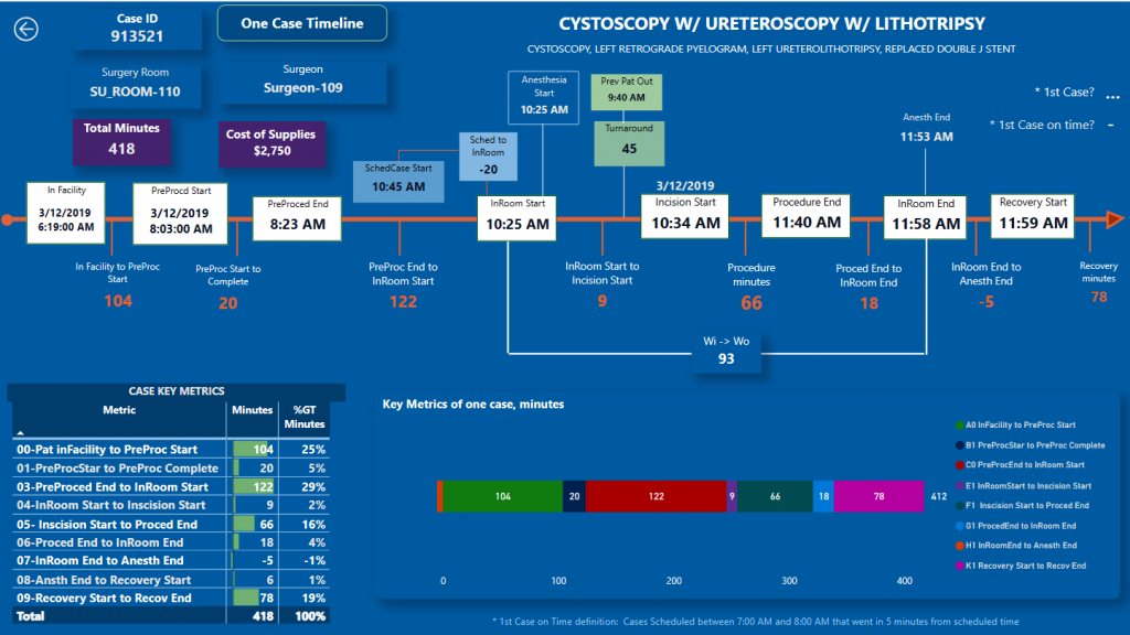
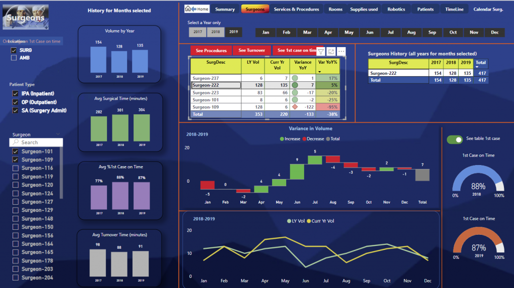
SURGEONS This visualization allows selecting one or all surgeons and shows how the current year’s surgery volumes compare to the previous year. The graphs show the monthly variation and the percentage of first cases attended on time. SERVICES AND PROCEDURES (SURGERIES) This visualization allows selecting a service—in this case, we have selected urology. The table shows all urology procedures performed, volumes from the previous year, volumes from this year, and the year-over-year variation. The graphs also show variations for each of the surgeons in urology and, of course, show the graphs of first case on time. SURGERY ROOMS In this visualization, several surgery rooms have been selected, and it shows a year-over-year comparison of usage in percentage, that is, the available time of each room versus the total surgery time in minutes. It also shows the processed volumes in each of the surgery rooms. CASE STATUS This visualization shows the completed and scheduled cases by week for the selected date range. ROBOTIC SURGERIES For hospitals with one or several robots, this visualization shows the processed volumes for the previous year and the current year, as well as the variation, along with graphs showing the compared volumes for each surgeon and each month of the year. It also shows the graphs of first case on time. To get a better idea of the month-to-month variations for each of the procedures performed with the robot, you can hover over some of the numeric values to see a month-to-month variation graph. PATIENTS In the patient visualization, admitted and non-admitted patients are shown. It displays volumes for the previous year and the current year and the variation. It also shows the surgeons who attended each case, compared by year, as well as the first cases on time. On the left, a column chart shows the proportion of admitted and non-admitted patients over the years shown. ADDITIONAL OPTIONS KEY METRICS In these options, values are shown that analyze how hospital resources are being used, how the processed volumes compare by surgeons, and the number of volumes by procedures, as well as averages and annualized values. STAGES OF A SURGERY This option allows filtering by location or type of surgery, by surgeon, and for a specific procedure or case to see how that case developed and the times taken for each stage. We will select a case, and you will see in detail each stage of the surgery, starting with the date and time the patient arrived to be prepared, the time taken to prepare the patient for surgery, the scheduled time for surgery, the time the patient was taken to the operating room, the time surgery began, the time it ended, and finally the recovery time. The graph below shows each of these times, and the table on the left also shows the times more descriptively. MEASUREMENTS BY SURGEON Here it shows for urology the volumes handled by each surgeon. It is also shown graphically in the column charts on the right, with averages by year for each stage of surgery as previously shown, and below a graph with the four main stages of surgery compared by surgeon. FIRST CASE ON TIME The definition of first case on time is the surgeries scheduled between 7 and 8 AM and started within 5 minutes of the scheduled time. In this visualization, we will select a service—in this case, urology—and the tables show the surgeons for whom there was planning or scheduling of the first case between 7 and 8 AM and the results. The table on the right below shows the first cases on time. By selecting a surgeon, you can see the cases, the history of the cases started on time or late. In this example, it shows the entire history of the surgeon in the right table and in the graph with the cases scheduled as the first case and which started on time. The table shows in green those started on time and in red those started late. PROCEDURES AND SURGEONS In this visualization, you can compare several surgeons for a specific metric of some of the cases they attended. You can filter by different locations or different types of service and for a primary procedure and then select one of the stages of surgery to see the average time by surgeon. MONTHLY AND ANNUALIZED AVERAGES In this visualization, you can see the volumes completed by urology surgeons until August 2018 and the annualized projection. It also shows on the right the averages by surgeon compared to this year with the previous year. Below is a detailed daily graph to see the peaks and an accumulation chart of the surgeries. DOWNTIMES BETWEEN SURGERIES This visualization shows the minutes elapsed from the end of one surgery until the start of the next by surgeon, also by service. On the right, it shows a detail for each case or surgery. Below, in the column chart, the yearly averages are shown. |
 |
| IN SPANISH
Bienvenidos a la presentacion del Dashboard de Servicios de Cirugia Con Power Bi se puede leer de manera segura, archivos con millones de registros almacenados en cualquier tipo de base de datos y muestra en pocas visualizaciones en graficos y tablas la productiviad de cirugias y procedimientos y el uso de los recursos del hospital o clinica. El dashboard o modelo que les vamos a presentar ha sido instalado en varios hospitales en Estados Unidos y ayuda a la admisntracion del hospital a ver claramente todos los aspectos relacionados con cirugias, y muestra mediciones clave (Key Metrics). ————————— Menu Principal VISUALIZACION DE RESUMEN Aqui se muestra comparacion de volumenes de el año actual y del año pasado, asi como mediciones historicas por año para el area SURG (Cirugia), pero tambien puede mosrar Ambulatorio, Cardilogia y otros servicios. Una medicion importante es Primer Caso a tiempo y muestra en % el conteo de primeros casos a los cuales el cirujano llego dentro de la hora programada. Se muestra tambien La distribucion % por Tipo de Paciente y por Area. CIRUJANOS SERVICIOS Y PROCEDIMIENTOS (CIRUGIAS) SALAS DE CIRUGIA ESTATUS DE CASOS CIRUGIAS CON ROBOT Para que tengan una mejor idea de las variaciones mes a mes para cada uno de los procedimientos ejecutados con el robot puede colocar el mouse sobre alguno de los valores numericos vera en un grafico mes a mes las variaciones. PACIENTES OPCIONES ADICIONALES ETAPAS DE UNA CIRUGIA MEDICIONES POR CIRUJANO PRIMER CASO A TIEMPO PROCEDIMIENTOS Y CIRUJANOS PROMEDIOS POR MES Y ANUALIZADO TIEMPOS MUERTOS ENTRE CIRUGIAS LOS 10 DEL TOPE ARBOL ANIMACION DE VOLUMENES
SURGEONS SCORECARD This visualization allows you to select one or all surgeons and shows how surgery volumes compareD between this year and last year. The graphs show the variance by month and the % of first case on time. |
 |
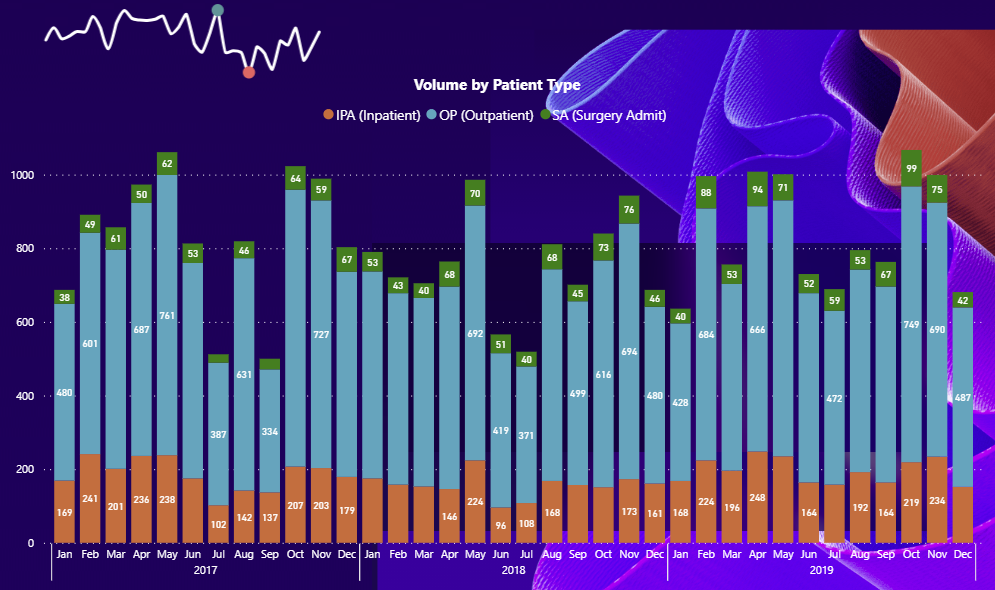
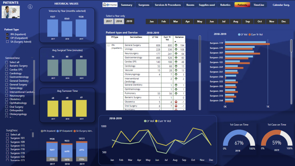
PATIENT SCORECARD: This school card shows volumes of patients treated by patient type inpatient and outpatient and the surgeons and the services for each type of patient and a comparison year over year. |
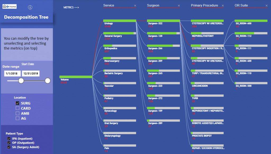
You can see graphically the volumes by service type surgeon primary procedure and or suite for any location this can be modified depending on what metric do you want to analyze |
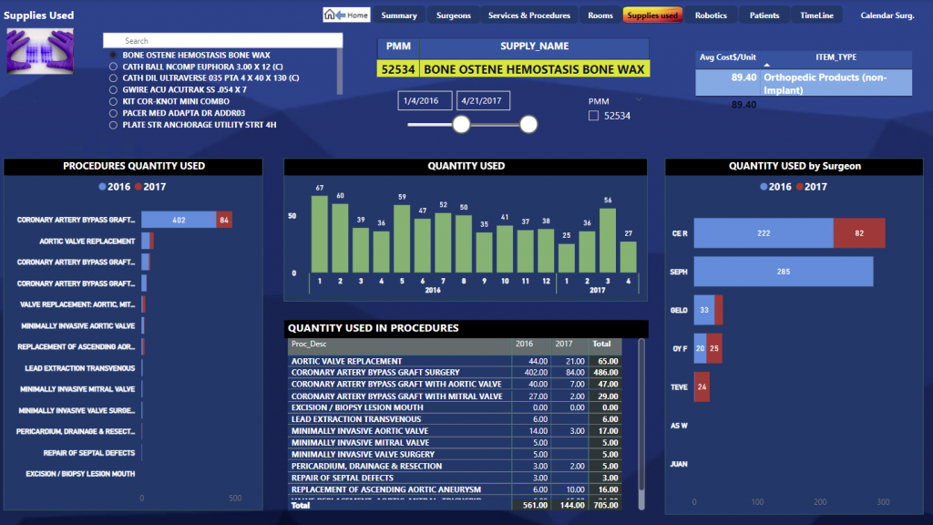
SUPPLIES SCORECARD: In this visualization you can see one supplies used in many procedures, the quantity, and the cost also by each surgeon for any procedure that is selected. |
 |